Graphic Narratives


What is a Graphic Narrative?


The term “Graphic Narrative is a general term used to identify illustrations with a story being told whether its completely fictional or a true story. Graphic Narrative is a broad terms and as such the following things fall under the term:

1. Comic Books – A comic book is a publication in the art form of comic art and usually consists of panels going along the pages in which the reader follows

2. Graphic Novels – A graphic novel is much like a comic book except the fact that it’s a novel. It does share the same comic-strip format though.

3. Manga – Manga is the Japanese equivalent of what comic books and graphic novels are to us. They are mostly aimed towards adults but some are made with children in mind too.

4. Bandes Dessinées – These are Franco-Belgian comics, Bandes Dessinées means this in French. They are exactly like comics and comic books except in a different language.

5. Novelas Em Quadrinhos – A much simpler name for this is Fotonovela, they’re novels in comics but utilise photographs instead of drawings to show a story. They’re popular in Brazil mostly.

Examples of Graphic Narratives –

1. Comic Books


This is an example of a comic book panel; this particular panel was taken from a Batwomen magazine. Comic books feature illustrated drawings and depictions of characters generally made up and their actions in relation to the story.

Typically, comic books are based upon superheroes and their attempts to stop crime or the villain. This is seen throughout all of the big and well know comic books In today's industry with big names like DC and Marvel leading the way.

2. Graphic Novels


Graphic Novels are very similar to comic books, their main different though is that they wont always be coloured like you’d expect a comic book. Another difference is the fact that a graphic novel tells the entire story from front to back.

Comic books don’t do this usually and feature multiple issues being published weekly, fortnightly or monthly.

3. Manga 

Manga is Japans way of publishing graphic novels and comic books. Manga is drawn and illustrated in their countries own traditional art style which can be seen also in anime, their animated way of story telling.

Black and white is used for these illustrations are the contents also features the Japanese language. In Japan, anime and manga is hugely successful and some of this has rubbed off to the other countries and places across the world.

4. Bandes Dessinées (Franco-Belgian Comics)


Bandes Dessinées are a form of comic books designed for French and countries that speak French. They’re produced in a more traditional art form but can still be digitally coloured and created for mass production. Like manga, Bandes Dessinées also use the language of people they were intended for. All of the text used in a Bandes Dessinées will be written in French. The word Bandes Dessinées is even French and means Franco-Belgian Comics and of course, Belgians speak French.

5. Novelas Em Quadrinhos (Fotonovela)


Novelas Em Quadrinhos are also called Fotonovela, and for the sake of simplicity I will be using this term to describe what they are.

In short, a Fotonovela is the same as a novel and comic in Portuguese. In English, comic books are generally illustrated and so are graphic novels. This isn’t exactly true in Fotonovela though. This Portuguese and Brazilian style of story telling is done using photographs to tell and progress a story instead of digital illustrations.

The Formal Elements

The formal elements of art are a series of parts which make up a piece of artwork. There are eight in total different things which culminate to create said piece of work. This includes:
  • Line
Line is what is refered to the path left from when you move your pencil for example. Lines can take a number of different forms, this ranges from horizontal lines to lines which also go in all four diagonal directions. On top of this, curved lines also fall under this category and make connections to contours as well as movement and emotion. For example, a hard and short line gives off a different feeling to that of one which flows better.
  • Shape
 A shape is the enclose area of a line which joins from its beginning to its end. Shapes are able to be just an outline but can also take on the form of being shaded in. There are two different kinds of shapes, this entails geometric shapes and irregular shapes. A geometric shape is one like a triangle or square, whereas an irregular shape can take on the form of an octagon for instance by having the same amount of sides but not resemble the geometric form of an actual octagon.
  • Form
 Form is relative to a shape in that form is just a three dimensional shape, an example of a 3D shape would be a cylinder or cone. Sculpting also falls down into this category as the purpose of sculpting and 3D design is creating form, in addition, tone and perspective can be used in order to create the illusion of form.
  • Tone
Tone is the lightness or darkness of something either 2D or 3D. This refers to the shade of an object or how light or dark the actual colour of something may be. Tone from lightness and darkness can be split into two different parts, lighter parts are called highlights whereas darker parts of the object are called shadows. Every object has a range of tones between the highlights and shadows.
  • Texture
Texture is the surface quality of something and the way something feels or looks like it might feel, this leads to two types of texture, actual texture and visual texture.

Actual texture - Actual texture is kind of a given, but for the sake of explanation, actual texture refers to texture that really exists, you can create it in your own work by sticking fabrics to a canvas and is also seen in some children's books, letting the child explore different textures and how things feel.

Visual texture - A visual texture is created using marks and streak of a pen, pencil or paint brush which is done to mimic and represent actual texture. This will give the illusion of a texture or surface being on a canvas but if you were to touch it, the surface of the canvas would be smooth. Lines, shapes, colours and tones can all be used in order to create this effect.
  • Pattern
Patterns are created using repeated lines, shapes, tones or colours in a random order way in which a full piece of paper can be filled with no gaps. Take a hexagon for instance. The word a pattern is commonly refered to is called a 'motif'. Motifs are able to be created from simple shapes or even a complex arrangement of shapes, geometric or irregular.

It is worth noting that a pattern can also be man-made just like a design on a piece of fabric or completely natural, like the markings on a tigers fur.
  • Colour
There are three different categories of colours, primary, secondary and tertiary.

Throughout this segment I will be referring to and back from the artist Piet Mondrian. I'm doing this because when I was taught of different colours, this is the artist we looked at for primary colours.
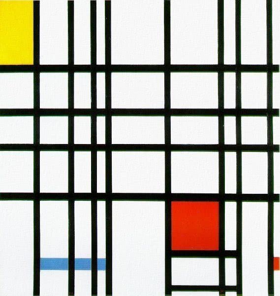
Piet Mondrian was a dutch painter who is know for his paintings like 'Composition with Red, Yellow and Blue' as seen here. The reason why i'm referring to this image is because it features the three primary colours of the colour wheel. 

The primary colours shown are red, yellow and blue. This is because with all three of these colours, you are able to make any every secondary colour.

Red + yellow makes orange
Red + blue makes purple
Blue + yellow makes green

This means that Orange, Purple and Green are secondary colours. Secondary colours can then be mixed with primary colours in order to create a Tertiary colour, this must be done with accordance to the colour wheel.

For example, red + green will create grey, the same how if you mixed yellow + purple or blue + orange, you'd also get grey. Where creating creating tertiary colours works is when they are harmonious.

Here are the possible combinations in which a tertiary colour can be made:
  1. Red + Orange
  2. Red + Purple
  3. Blue + Purple
  4. Blue + Green
  5. Yellow + Green
  6. Yellow + Orange
  • Composition 
Composition is applicable to all forms of art, this means music, writing and photography but the case of photography and illustration, the Rule of thirds is used. I touched and explained upon the Rule of thirds and how it is used in photography in my last unit of work but now I will explain once again how its used.

 Take this image for example, the Rule of thirds is overlaid onto the original image to show and explain what is meant by the Rule of thirds. 

Here you can see the cheater in the left hand side of the image. This is done because with the rule of thirds, your aim is to create a point of interest where the lines going horizontally and vertically meet. In this case, the cheater falls into the two points on the left and therefore is the main focus of the image. 


On top of this, the cheater also fills up six of the nine squares present and so leaves three squares of background where the viewer would not focus on.

Image Captioning

Images are captioned nowadays in our everyday life. When we look at a newspaper, images have a caption. When we look at websites, the images may have been captioned. And even when you check social media, images generally have captions.

But why do we add captions to images?

We add captions to images as means of providing more information to the image supplied as well as to give context where it's needed, so it's no wonder why the use of captioning is so popular in todays society.

Captioning in newspapers -


In this example we can see that below the image is a caption to which accompanies it. In the caption it explains more about who is features and what is going on. This is seen by "Enjoying Asian-American cuisine" "At fro City Councilman Mark Squilla" and then a proceeding list of names of which are featured in the image.

This example also touches upon the racism and legal issues within a newspaper and its writing where three indivuduals are called "Me Too", "Chinky Winky" and "Dinky Doo". I plan touch more on racism and discrimination in media and the requires with children's books on how everyone should be portrayed equally.

Captioning on social media -


Here, captioning has been applied to give context to the video posted along with it on Facebook. The video itself focuses on two people trying and eating a new burger called the "Chicken Buddy Burger" made by A&W Canada. The captioning above the video helps the viewer understand more about the scenario and video presented as well as promote the new burger even more. Words like and phrases like "All our chicken", "Raised without the use of antibiotics" make the food seem more enticing and addresses health concerns people may have about the treatment of chicken in their food or the burger itself.

The representation of gender, race and sexism in children's book

For children's books it's important to remain on a neutral and even stand point in which every character is portrayed equally and no character is made as worse off than another. This falls under categories in which prejudice or discrimination may be made.

Gender - 

Gender in children's books is a fairly simple concept to grasp and has one main rule. "Portray women as equal to men in your storyline". This means that the characters in a children's book must perceive and show off male and female characters as equal, meaning female characters cant be featured in situations of distress (within the realms of being child friendly) without the male character also having the same issue. A misconception would be that there needs to be equal amount of roles of females to males which isn't entirely true. Yes it's true both genders should be represented equally but if a book is tailored and catered towards boys, that doesn't mean the book must feature females as well.

Race -

Race within anything can be a touchy subject and so in children's books it follows the same rule of gender. All different races should be treated the same in children's books if presented as well as not create a distinguish between one being inferior to another. Not only because this extremely out of line within modern society but also because it has been scientifically proven that no human race is biologically superior to another. Everyone has the ability to strive and achieve.

Language used that features black themes or depicts that people of other races as a minority and not as great is a criminal offence, contained in section 50A and section 96 which includes both racially aggravated harassment and racially aggravated behaviour as well as racial aggravation of other common law offences.

Sexism - 

Sexism refers to the words used in a children's book more than anything. Some words in the eyes of how a children's book should be written demeans girls and woman, meaning they are made worse off much like how gender is covered earlier. An example of some words that should be used are:
  • Manufactured not Manmade
  • Firefighters not Firemen
  • Ancestors not Forefathers
Though there isn't anything typically wrong with these words in the real world, in children's books it's important to remain on an equal ground and make sure every gender and person is treated the same as the next.

How children's books are published

Convincing a publisher to take on your book -

Before publishing your own children's book, it is important to study and research the market you're wanting to get into. Because publishing is a commercial business, you need to convince not only the publisher to like your book but also convince the fact there is in fact a potential market for your book of choice to publish.

Finding the right publisher -

This is why it's extremely important to find the right publisher for you. In the case of children, big publishers like Puffin Books and Ladybird are ideal and specialise in books for children. A suggested technique is to going to a well known book shop and look at the children's section to find out whether or not your book may sit nicely onto a shelf next to the others of that same genre and publisher.

Find out if they accept books via submissions -

Once a publisher is found, it's important to find out whether or not they accept submissions. The best way to do this is to firstly email the publisher or ring them with a telephone first, doing this you can be directed to whoever you may need to talk to and their contact details in which you can then arrange a time and place to pitch your book to the publisher. If they don't accept submissions, you will need to find a new publisher of your liking and repeat the process.

Pitching your children's book - 

In this stage you will prepare to present your book in a format best for your publisher. Your pitch will start of with a covering letter. In this segment you will be explaining why the company should publish your book and why they're the right company to do it.

Inside the pitch you also will be asked to provide a few chapters from your book as well as a synopsis, this will give the person reviewing your book and insight to whether or not it's worthy of being published.

Task 2: Developing Idea's

Task 2 explores the development of idea's now moving on from the research of how a children's book gets published and the language which has to be used in it. The purpose of task 2 is to create a basis on which I can start to create and base my story and illustrations on. In this segment I go over existing children's book's as well as conduct a survey for children to answer to further my understanding of what needs to be in a children's book and what books they like. From this, I am able to play and develop my own pages for my children's book.

The other topics will also be covered within Task 2:
  • Rationale of children's book
  • Very early written plan of story
  • Different artistic techniques - Wax resist, photographic editing, painting with rollers etc...
  • Images relating to my idea's of a children's book I want to make
  • Finalised story
  • Creation of characters - Super Heroes, Robot: Class Exercise

Rationale of childrens book

This essay serves as rationale for the strategy used in planning and researching my project, the Children’s book.

First, a culmination of steps and processes must be done in order to reach the desired and finished point. These steps include a combination of researching in my own time using pre-existing children’s books and also going out and interviewing children with a small set of questions to gage an idea of what the child likes to see in a book and what their favourite book is.

Once the interviews have been conducted and finished, I will then go into further research looking up the favourite books the children listed. What this does is help me get a brighter and even bigger idea to what a child would like to see. It also gives an insight to the style of illustration used and if its simple or complex, on top of this, the language and way things are written will also be taken into account.

I will do this because its important to make sure that your children’s book is readable by a young audience and connects to them on a level they can understand. Larger and more complex words will be replaced with simpler and easier to say and understand words. An example of this would be using the word ‘And’ instead of ‘Therefore’ or ‘hence’.
                                                                                           
The illustrations and way the art has done in existing children’s books also matters to the same degree as the language used. A child probably wont be able to understand a super detailed and big piece of work. Not only that, the detailed piece of work wont get my point across as easily as perhaps a simple illustration of a character performing an action would. In the case of children, making things simpler and easier for the child reader to understand is key, both in the words and language you use as well as the illustrations.

After researching existing books and finding out the children’s opinions on what makes a good children’s book, I can begin to finalise and develop my final idea for creating a children’s book. This includes character design and creation, a story and something to base my story around. Is it linear or non-linear? What happens and is it easy for the child to understand the events that take place?

Once an idea has been finalised and my characters have been made and story completed it’d then be time to go through and make a page layout. Certain questions I have to ask myself and overcome include; What will happen on each page? What illustrations will be presented? Where does the text go? A mock up of the children book should be created with rough illustrations and the text starting to be put into place, then when this is done I can begin to move on to start creating my final and finished product.

Each page will take into account the planning as well as other steps done before earlier in the research process, my original plan is to produce a page fully illustrated and produced on a day by day basis until the book is done. This plan is flexible if time becomes an issue where I am able to produce two or more pages per day, this also determines on the length of the children book though, this is also something I will need to take into account.

When every page is completed and finished, they will be compiled together using InDesign from Adobe and put into the format of a book and then produced and put together as if the book was a real product that could be sold.

To conclude, I will be using multiple different techniques I order to create my children’s book, this includes the use of researching and looking into existing children’s books and also interviewing children to get an idea and create a basis on which I can work around that also appeals to children. From here I can then begin to plan out and create my book until its ready for print.