- Line
- Shape
- Form
- Tone
Tone is the lightness or darkness of something either 2D or 3D. This refers to the shade of an object or how light or dark the actual colour of something may be. Tone from lightness and darkness can be split into two different parts, lighter parts are called highlights whereas darker parts of the object are called shadows. Every object has a range of tones between the highlights and shadows.
- Texture
Texture is the surface quality of something and the way something feels or looks like it might feel, this leads to two types of texture, actual texture and visual texture.
Actual texture - Actual texture is kind of a given, but for the sake of explanation, actual texture refers to texture that really exists, you can create it in your own work by sticking fabrics to a canvas and is also seen in some children's books, letting the child explore different textures and how things feel.
Visual texture - A visual texture is created using marks and streak of a pen, pencil or paint brush which is done to mimic and represent actual texture. This will give the illusion of a texture or surface being on a canvas but if you were to touch it, the surface of the canvas would be smooth. Lines, shapes, colours and tones can all be used in order to create this effect.
- Pattern
Patterns are created using repeated lines, shapes, tones or colours in a random order way in which a full piece of paper can be filled with no gaps. Take a hexagon for instance. The word a pattern is commonly refered to is called a 'motif'. Motifs are able to be created from simple shapes or even a complex arrangement of shapes, geometric or irregular.
It is worth noting that a pattern can also be man-made just like a design on a piece of fabric or completely natural, like the markings on a tigers fur.
- Colour
There are three different categories of colours, primary, secondary and tertiary.
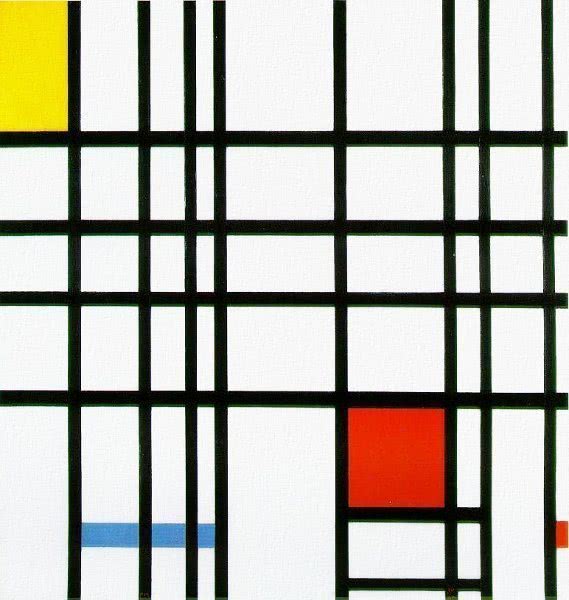
Throughout this segment I will be referring to and back from the artist Piet Mondrian. I'm doing this because when I was taught of different colours, this is the artist we looked at for primary colours.
 Piet Mondrian was a dutch painter who is know for his paintings like 'Composition with Red, Yellow and Blue' as seen here. The reason why i'm referring to this image is because it features the three primary colours of the colour wheel.
The primary colours shown are red, yellow and blue. This is because with all three of these colours, you are able to make any every secondary colour.
Red + yellow makes orange
Red + blue makes purple
Blue + yellow makes green
This means that Orange, Purple and Green are secondary colours. Secondary colours can then be mixed with primary colours in order to create a Tertiary colour, this must be done with accordance to the colour wheel.
For example, red + green will create grey, the same how if you mixed yellow + purple or blue + orange, you'd also get grey. Where creating creating tertiary colours works is when they are harmonious.
Here are the possible combinations in which a tertiary colour can be made:
- Red + Orange
- Red + Purple
- Blue + Purple
- Blue + Green
- Yellow + Green
- Yellow + Orange
- Composition
Composition is applicable to all forms of art, this means music, writing and photography but the case of photography and illustration, the Rule of thirds is used. I touched and explained upon the Rule of thirds and how it is used in photography in my last unit of work but now I will explain once again how its used.
Take this image for example, the Rule of thirds is overlaid onto the original image to show and explain what is meant by the Rule of thirds.
Here you can see the cheater in the left hand side of the image. This is done because with the rule of thirds, your aim is to create a point of interest where the lines going horizontally and vertically meet. In this case, the cheater falls into the two points on the left and therefore is the main focus of the image.
On top of this, the cheater also fills up six of the nine squares present and so leaves three squares of background where the viewer would not focus on.
No comments:
Post a Comment